
Regulars Brand Identity
Identity for Regulars — a neighbourhood tavern in Henderson, Nevada, built on old-Vegas glamour. A marquee-bulb script logotype, a Peacock Blue and Yellow Gold palette, Fraunces and DM Sans, and an eleven-chapter brand book that runs from archetypes to neon signage, a vintage-phone bar installation and video walls.
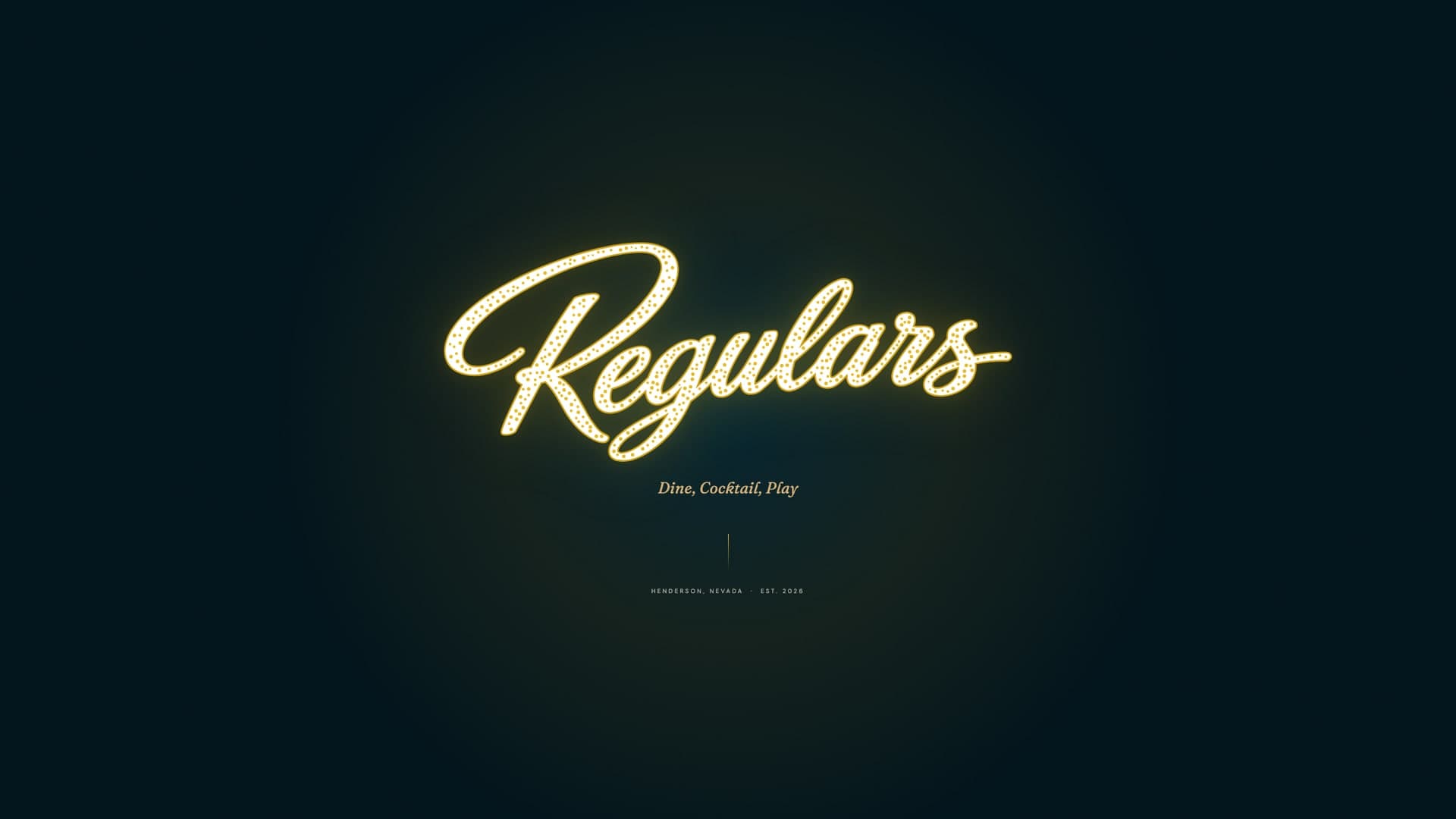
Regulars is a bar for the people who live in Las Vegas, not the people visiting it — “The bar that knows your name.” The strategy pairs the Everyman, who wants belonging without pretense, with the Lover, who brings the warm light, classic cocktails and mob-era romance. Six attributes hold the line between the two: welcoming, nostalgic without kitsch, relaxed yet sophisticated, community-focused, loyal and indulgent.
The logotype is a script set in marquee bulbs — the Regulars name written the way old Fremont Street wrote names, in light. It ships on Peacock, Shoji White and Midnight, and goes physical as 3D neon-bulb letters on a push-through outdoor marquee. Peacock Blue (#093E50) carries the ground and Yellow Gold (#E8B923) the neon pop, backed by Classic Tan, Shoji White, Mob-Era Green and Candlelight, with three electric accents kept for nights out. Fraunces is the soul; DM Sans does the work.
The book goes past the logo into the room. Voice rules written as “we say / we don’t say”, an icon set for menus and signage, Ring ma Bell — ten vintage telephones networked across the bar — two LCD video-wall configurations for game nights, a menu layout and business cards. A Visual Heritage chapter maps four eras of Las Vegas — The Sit-Down, The Main Room, The Floor and The Regulars — to colour, light and image-generation briefs, and a 1920px grid system carries the identity onto screens.
The brand book is published as a living web document alongside the pre-launch site, so the client, fabricators and the interior team all work from the same live reference.
- Brand strategy — mission, vision, archetypes and attributes
- Marquee-bulb script logotype and colour variations
- Colour palette — primary, supporting and electric accents
- Typography system (Fraunces + DM Sans)
- Voice and tone guidelines
- Icon system
- Outdoor marquee and 3D neon-bulb signage
- Installations — Ring ma Bell phone network, LCD video walls
- Menu layout and business cards
- Visual heritage, look & feel and image-generation briefs
- Grid system and web brand book
Inside the identity
01Strategy & Voice
02Identity
03In the Room
04Heritage & Look
Let’s Add Your
Project to This List.
Every project in this portfolio started with a conversation. Tell us what you’re building and let’s make something we’re both proud to put our names on.
25+ years experience · 50+ projects delivered · On-time, every time