
HAOG Brand Identity
Identity for HAOG — Heritage Auto OG — a protocol for fractional ownership of classic cars. A twin-star logomark built from the Ruler archetype, an extended display face, a charcoal-and-sugar palette with three hot accents, and a 58-slide brand book that carries it from business cards to banners.
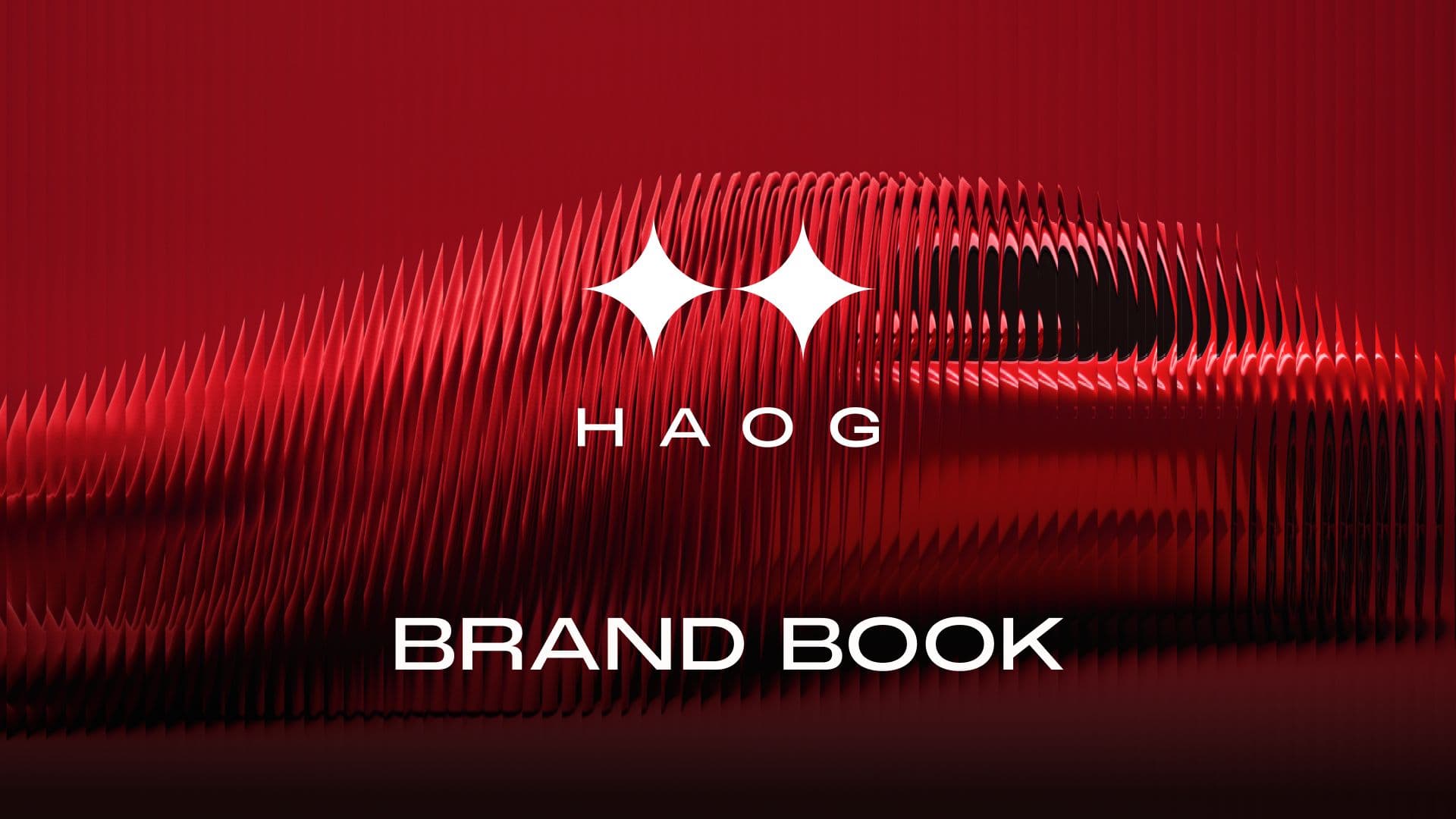
HAOG sells shares in cars that have only ever changed hands between a few collectors. The identity had to carry the authority of a heritage marque while staying honest about what the product is: a blockchain protocol. We started from strategy rather than shapes — the Ruler archetype, HAOG as the leader (the North Star, Polaris) in a space where tradition meets innovation, and the blockchain itself — then pinned down eleven attributes the brand must always read as: iconic, luxury, serious, niche, expensive, technical, global, formal, monochromatic, minimal and conventional.
The logomark is built, not drawn. Circles on a strict grid cut a four-pointed star — the guiding star of the Leader — and two of those stars side by side form both the crossbar of the H and a link in a chain. Paired with a wide-tracked HAOG logotype set in PP Monument Extended, it locks up two ways: stacked as the primary mark, and horizontal as the secondary.
The rest of the system stays deliberately quiet so the cars can be loud. PP Monument Extended handles display; PP Neue Montreal handles everything that has to be read. The core palette is just Charcoal Gray (#121212) and Powdered Sugar (#FDFCFA), with Red Candy Apple, Purple Electric and Yellow Cadmium held back as accents — the red doing most of the work, in photography as much as in UI.
Everything is documented in the HAOG brand book: 58 slides across brand core, tone of voice (authoritative, exclusive, innovative, transparent), logo usage and misuse, typography, colour, stationery, digital, a print-to-phone grid system and an image library. The book is a working Figma file — tokenised colour with Light and Dark modes, a structured type scale and a logo component set — so it reads as a clickable prototype as well as a document. The identity deck that sold the concept to the client is available below as a PDF.
- Brand strategy — archetype, positioning and attributes
- Logomark and logotype construction
- Primary and secondary lockups
- Typography system (PP Monument Extended + PP Neue Montreal)
- Colour palette — primary, accents and shades
- Tone of voice
- Stationery — business cards, letterhead, ID badge, coins
- Digital applications — website, mobile, social, banners
- Grid system for print, web, tablet and phone
- 58-slide brand book as a Figma prototype
Inside the identity
01Strategy
02Identity
03Brand Book
04Applications
Let’s Add Your
Project to This List.
Every project in this portfolio started with a conversation. Tell us what you’re building and let’s make something we’re both proud to put our names on.
25+ years experience · 50+ projects delivered · On-time, every time